Before I go into my discussion on what I think of the new Emi sprites, I'd just like to add that this is just my opinion and I recognise that. It's not me demanding the devs fit it to my specifications, it's just honest feedback.
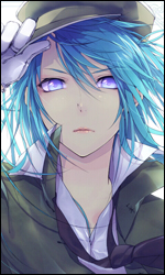
First off, the new CG (
here; it's a bit too large to just post)
Overall I understand the new direction with the different colour blade cups and the bandages, but I preferred it the other way. It just seemed more natural for them to be flesh coloured, making them purple makes them look at lot more plastic to me. That's really just pettiness, though. The thing that really bugs me about the new CG is the expression. Something about the eyebrows mixed with the smile makes it seem a little... I guess sarcastic? As long as we're on the CG, note the length of the bloomers.
Next, the puppy dog eyes sprite.


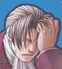
This is one of my least favourite sprites. I think it's the darkening around the eyes, but in this sprite I always think Emi is wearing too much eyeshadow or something, and it makes it less "adorable pouting puppy" and more "sulky tart", which doesn't really seem to fit the character as much.
Moving on, the blushing sprite


This one's adorable, and one of the best displays of what I like about the new sprite design. However, notice the bloomer length. It's a bit of an odd complaint, but they seem to have gotten a lot more like underwear since the last version, and even since the CG.
Winking/Eyes closed sprites


It's been mentioned before, but the eyebrows look a bit sketchy and out of the style.
Frowny sprite

This is my second favourite sprite of her new set, it's adorable.
Other blushing sprite

The blush looks a little odd and there's the eyebrows thing, but otherwise nice.
Smiling sprite

This is my favourite of the new sprites. I really think it's adorable.
So overall I really like the redesign, it's just a couple of the sprites that sort of bug me.


