Sorry, didn't make myself clear. I meant that alternatively to flags, I could've considered a coat of arms, as that's something I've at least done some research in. And after giving myself a night to turn things over in my head, I have some banner ideas that I might mock up given the time.
EDIT: And I did! Click on the thumbnails for full size! (And correct alpha transparency...)
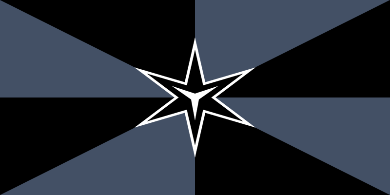
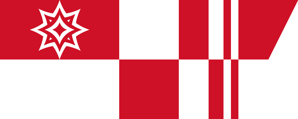
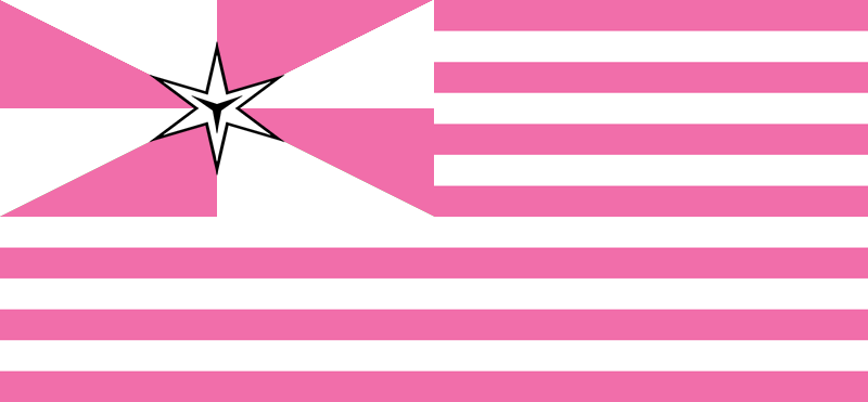
Shizune

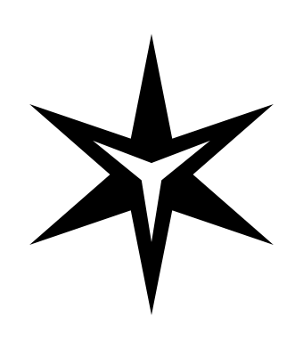
Shizune's was in my mind the most well fleshed out, as I pretty much settled on what I wanted to do before I fell asleep. I sorta stole the the star of dominance idea from Caesius, but I used a different design. I thought that Caesius' design was a little too intimidating (ha!) and am very happy with how mine turned out. It invokes the imagery of a
Maltese Cross, which is was a happy coincidence. I combined the star with strong upward lines that signify ascension and ambition.
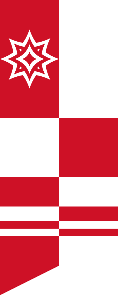
Misha

Misha's gave me a devil of a time. At first I wanted a variation of Shizune's with a stronger chevron motif (I love chevrons, btw) to signify how she supports Shizune's efforts. However, that sorta fell through when I wanted to try to somehow incorporate her drills, as well. I at first tried a spiraling vortex with a similar upward draw, but I just couldn't get it to work right. After finishing Hanako's banner I came back to this and all of a sudden realized I could just use the bottom pinions of the banner to invoke her drills and mirror Shizune's star on the top. And thus this... thing was born. In contrast to Shizune's sharp edges I decided to emphasize Misha's *ahem*
curves.
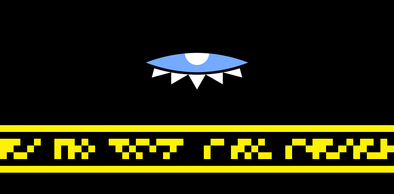
Hanako

Hanako's is still very much a work in progress. I'm not satisfied with this version. Again, I stole the star idea for Caesius, but I don't really intend on keeping it. The joke's rather obvious with how I colored the banner. That much was all that I really had in my head before starting. The original idea was the split coloring with three gold bands running down it, but it felt empty. I messed around with adding a book to it, but then it started to feel really busy. I have yet to find a good balance. I even tried stealing Caesius' eye idea (since Hanako and Lilly are going to share elements, anyway), toying with an asymmetric circle that would represent an eye, even hiding it partially behind my book emblem, but I dropped it and threw a star on it out of laziness for the moment.
More are on the way. I actually had a rather solid idea for Emi, too, and I only just remembered it. I'll try to finish it before the night is out.
EDIT2: Emi's is done

Okay, so it wasn't as awesome as I expected. I wanted to try for some more diagonal lines in the banners, and who better than Emi? It's my own take on the racing stripes motif. I sampled the little corner from Emi's hair beads, since her hair turned out unexpectedly pink. The other bands are poplar green, sampled from her eyes. It took a hell of a lot of tweaking between the gray of the banner and the green of the stripes to make sure they didn't clash too badly.


